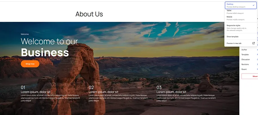
As of now, our page has two hero areas, each contained within a Group block. The next step is to set one of them to display on desktop/tablet devices, and the other on mobile. We’ll use the Block Visibility feature to make it happen.
Here’s a common scenario: Your website has a large hero area, complete with a high-resolution image, text, and a call to action (CTA). It looks great on a desktop device but is clunky on a phone. The image is too big, and there’s too much text for users to digest. What to do?
The first step is to create the two hero areas for our page. We’ll grab one from the WordPress Block Pattern library and see what we can do with it.
Before WordPress 7.0, we’d have to work around this limitation. That could mean installing a specialized plugin or writing custom CSS rules in a theme. Now, we’re only a few clicks away from choosing which blocks display on a given device.
Sample Project: Simplify a Hero Area for Mobile Users
The feature saves us time, improves the user experience, and won’t hog server resources. Most of all, it’s a sign of things to come for WordPress.
Oh, and be sure to test on different devices! It’s not enough to shrink your desktop’s browser window. You can use your browser’s dev tools to emulate a mobile device if you don’t have one handy.
Step 1: Create Desktop and Mobile Hero Areas
You may notice that the mobile hero no longer displays on the Block Editor canvas. That’s the desired result, as it won’t be in the way when working in Desktop preview mode.
Let’s simplify. We duplicated the desktop hero and made a few changes:
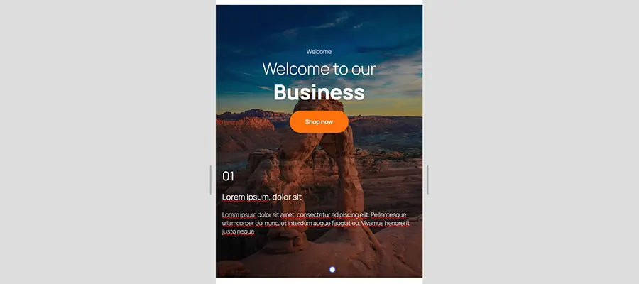
- We replaced the image with a cropped version that is optimized for smaller screens.
- We centered the text and CTA.
- We replaced the three columns of text with one, shorter passage.
- Finally, we tightened up the spacing to reduce scrolling.
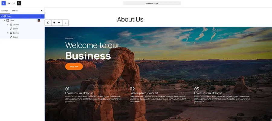
Note that you can also view and edit these blocks using the Document Overview (List View) feature (Shift+Alt+O). Select the block, click on the Options menu (⋮), and select Show from the menu. You can hide it again once you’re finished editing.
Step 2: Assign Hero Areas to Their Respective Devices
Responsive controls are a long-sought-after feature for the WordPress Block Editor. Changing a page’s design or layout based on a user’s device is a staple of modern web design. Yet, doing so in WordPress has typically required a third-party solution, such as a page builder. Thankfully, that’s changing.
Perhaps it’s a niche feature. But it’s also quite handy for targeting mobile or desktop users with specific blocks. And it’s also a gateway to more responsive controls landing in WordPress 7.1.
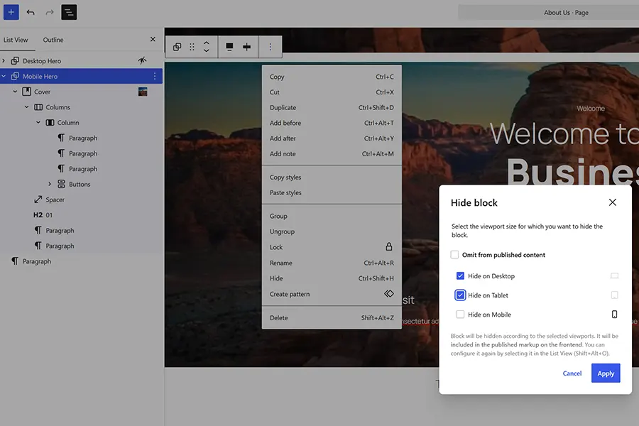
- Click on the Desktop Hero block we created.
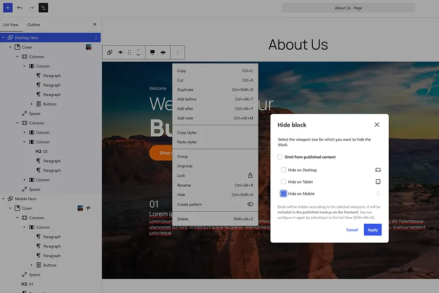
- Click on the Options menu (⋮) and select Hide Block.
- Choose the Hide on Mobile option.
- Click the Apply button and save the page.
The responsive Block Visibility controls will make this a piece of cake. We’ll create two hero areas – one for desktop and another optimized for mobile. The result will be a better user experience for everyone.
- Click on the Mobile Hero block we created.
- Click on the Options menu (⋮) and select Hide Block.
- We’ll choose two options this time: Hide on Desktop, Hide on Tablet
- Click the Apply button and save the page.
It’s often the little extras that make the biggest difference. Targeting different devices via the Block Visibility feature is a prime example. Its release didn’t draw much fanfare. However, it makes WordPress more flexible for designers.
Desktop/Tablet Devices:
Today’s tip will show you how easy it is to show or hide a block based on a user’s device. Here we go!
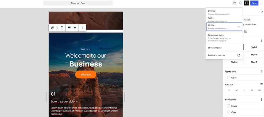
Switch to Mobile preview mode, and you’ll see the opposite effect. The desktop hero is hidden, allowing the mobile version to take over. You can edit these blocks when in the appropriate preview mode.
The WordPress project is slowly but surely inching toward responsive block settings. Version 6.9 introduced the Block Visibility feature, allowing you to temporarily disable a block without deleting it from a post. WordPress 7.0 took it a step further by adding options to hide a block based on device.
Our desktop hero area is beautiful on the big screen! It should also work well on tablets, such as an iPad. However, it may be overwhelming for mobile users.
Use Different WordPress Blocks on Different Devices
The mobile hero offers the same immersive look without the extra bulk.
Read more articles by Eric Karkovack
Mobile Devices:
Related Topics
here. He recently started a writing service for WordPress products: WP Product Writeup. He also has an opinion on just about every subject. You can follow his rants on Bluesky @karks.com.